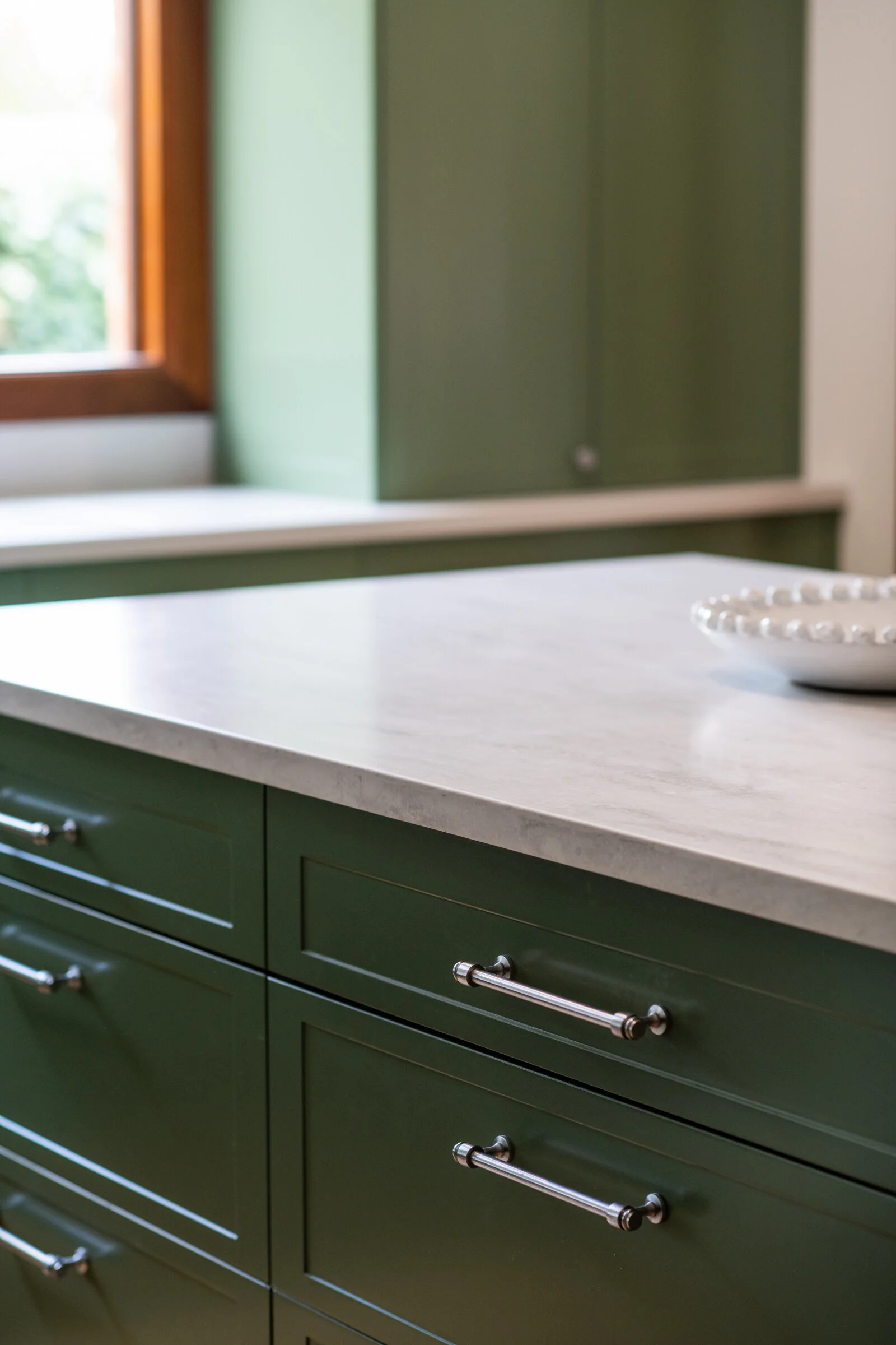
We re-designed the interior of this 1920s home in central Orange to make it a functional family space. A rear 1980s extension was poorly designed, with a lot of unusable space. Interior walls were removed to convert a study nook, coat cupboard and 4th bedroom at the rear of the house into a light and bright open-plan kitchen and dining area.
The old kitchen was turned into the 4th bedroom, and the old, dark and pokey dining area became a generous sized study and second sitting room.
Kitchen
We widened an existing window to flood the kitchen with natural light and make the most of the view over the shaded side courtyard. A narrow floor-to-ceiling window allows a watchful eye over the backyard.
This was a very tight space that had to work hard to accommodate the storage needs of a growing family.
The island bench has seating for four, as well as additional hidden storage under the over-hang. Drawers make everything easily accessible, wile a narrow charging cupboard on the fridge side means no devices left lying around to charge on the island bench.
A floor-to-ceiling pantry has ample food storage, while the bench-top appliance cupboard hides away appliances.
We patched up the existing timber floor and refinished it in a warm honey satin coating to complement the existing cedar architraves and doors. The green cabinetry is a lovely fresh counter-point to the darker elements of the original home, while also echoing the ivy climbing up the courtyard wall.
Builder: Grant Build
Kitchen: Zylem Joinery


