Warrendine St - Full Home Renovation
This 1920s Federation home in central Orange was in dire need of a make-over to increase storage and functionality for a family of four. We renovated within the existing roofline, reconfiguring the bathroom, kitchen & laundry and updated the tired fittings, fixtures and colours. The master bedroom was extended to add an ensuite and walk-in robe, making better use of a wrap around verandah on the eastern side of the house.
Bedrooms
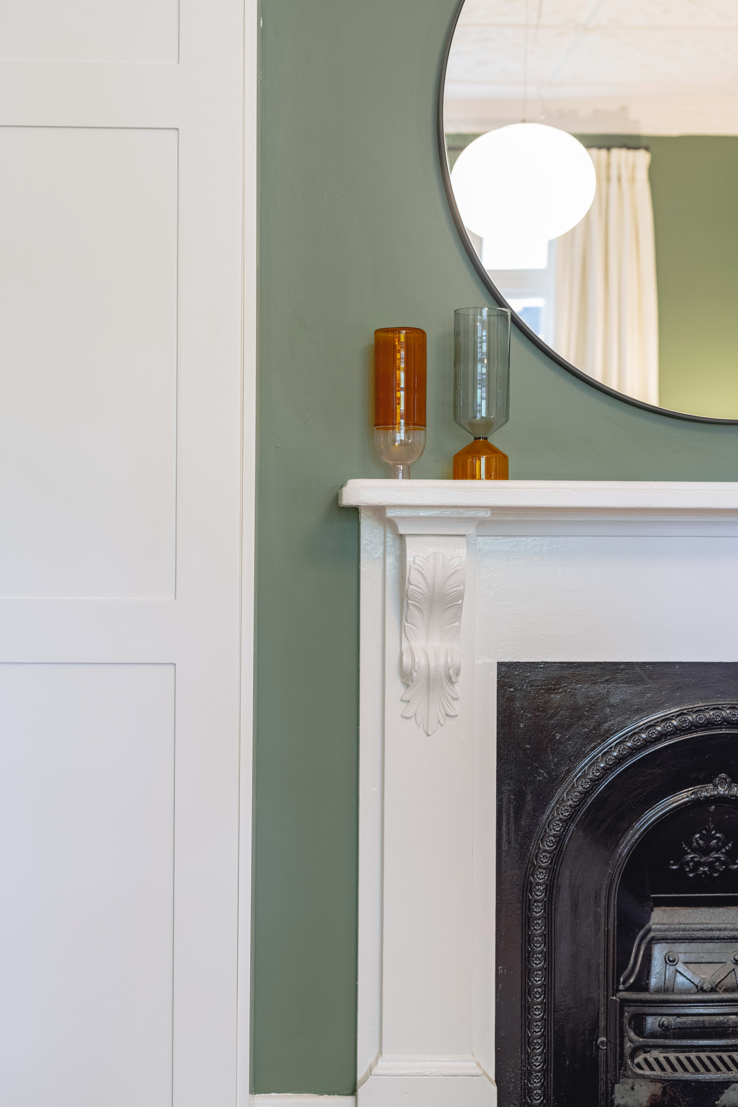
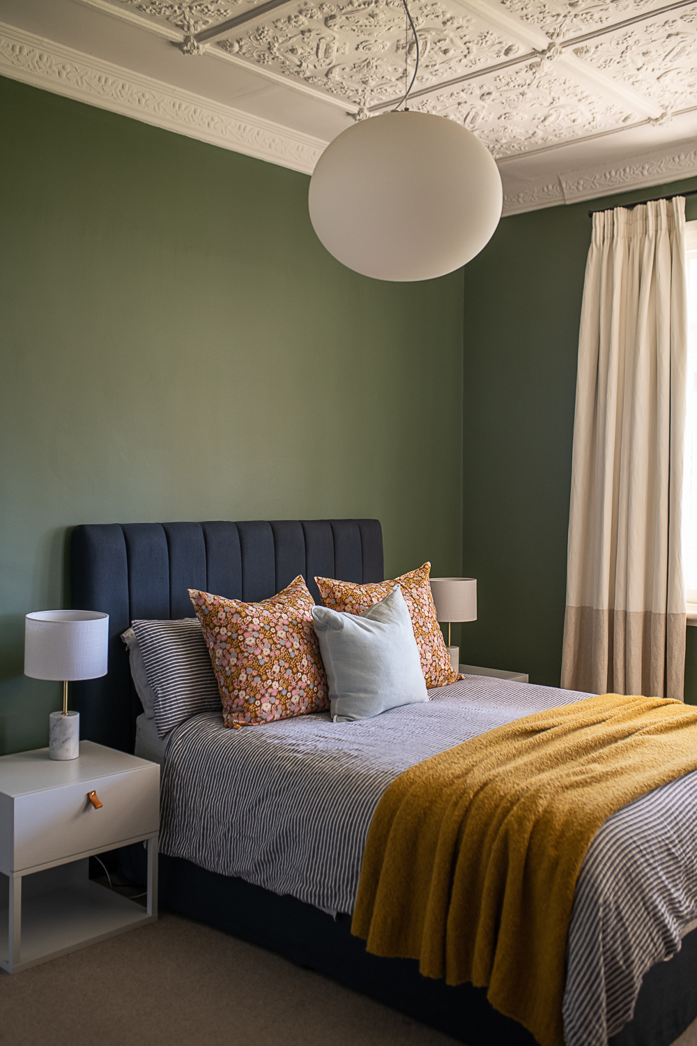
We sourced a near identical window for the eastern side of the house to add light to this room, which was originally the formal lounge & dining room. A deep forest green adds a calming cosy feel, while high-lighting the original decorative plaster ceilings. Built in full-height robes were added either side of the fireplace for storage.
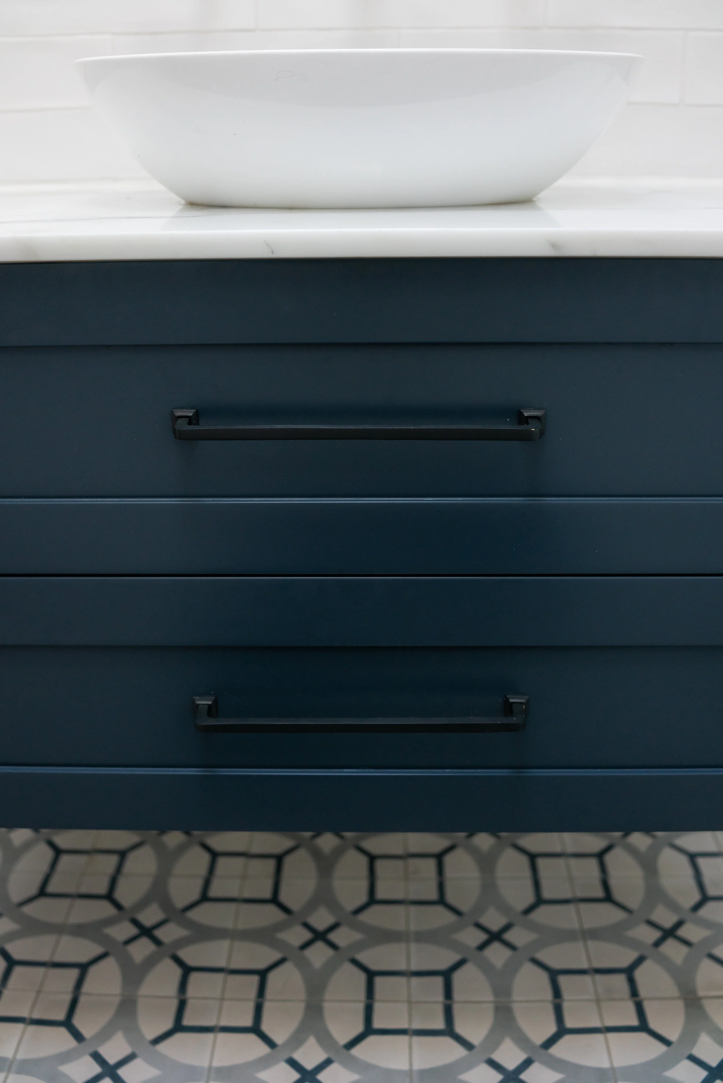
The main bathroom and laundry was a rabbit warren of doors…5 in total in a tiny space. The entry hallway and passage through to the kitchen wasted valuable space. We took out an internal wall and removed an unnecessary thorough-fare to increase laundry storage. The palette of blues and greys was repeated from the ensuite bathroom for a cohesive feel, while still giving this space it’s own personality.
Bathrooms
The main bathroom and laundry was a rabbit warren of doors…5 in total in a tiny space. The entry hallway and passage through to the kitchen wasted valuable space. We took out an internal wall and removed an unnecessary thorough-fare to increase laundry storage. The palette of blues and greys was repeated from the ensuite bathroom for a cohesive feel, while still giving this space its own personality.
Using the existing roofline, we added an ensuite for the master bedroom. With a walk-in robe separating a shower & toilet space, this 1.7 wide footprint with some clever design & storage ideas made use of an unused eastern verandah. Original windows and stained glass features were sourced to make this bathroom feel like it was always part of the home.
Laundry
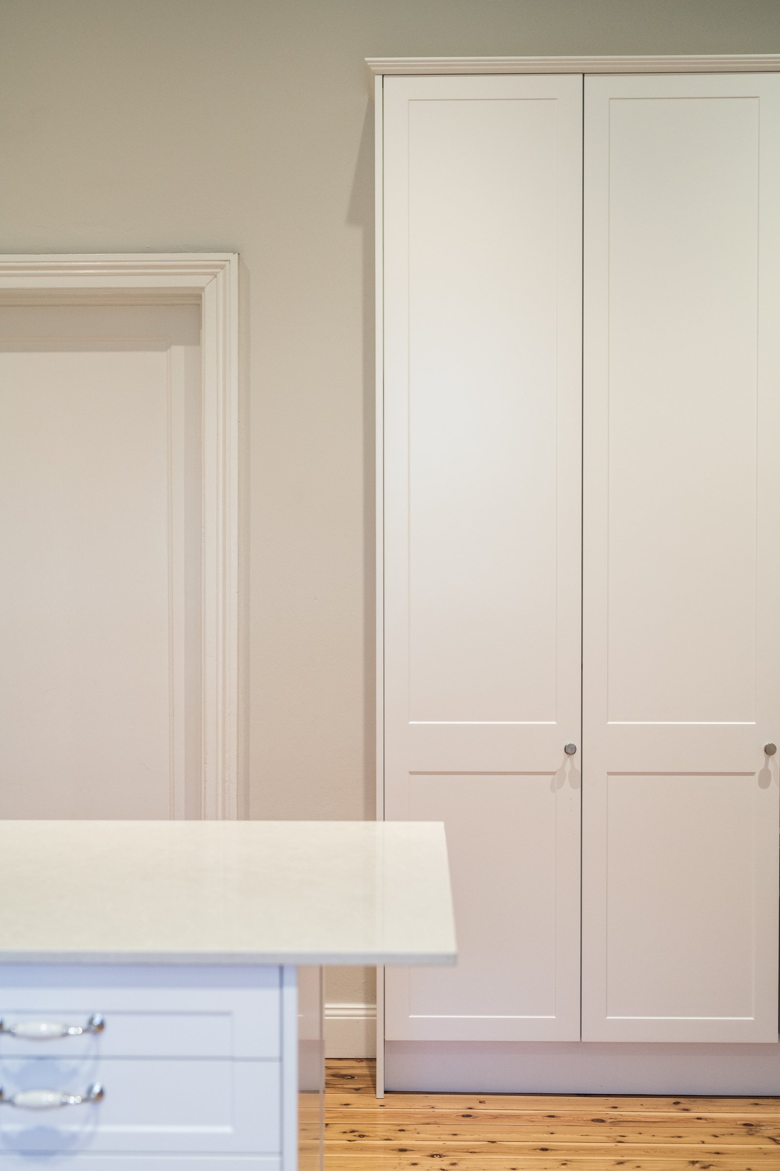
The laundry was opened up by removing an internal wall, which allowed for another bank of storage. The full height cupboards hide a vacuum and broom cupboard, as well as two internal pull-out laundry hampers for sorting lights and darks, and ample room for storage of sheets and towels.
A glass panel door now floods the room with light.
Kitchen
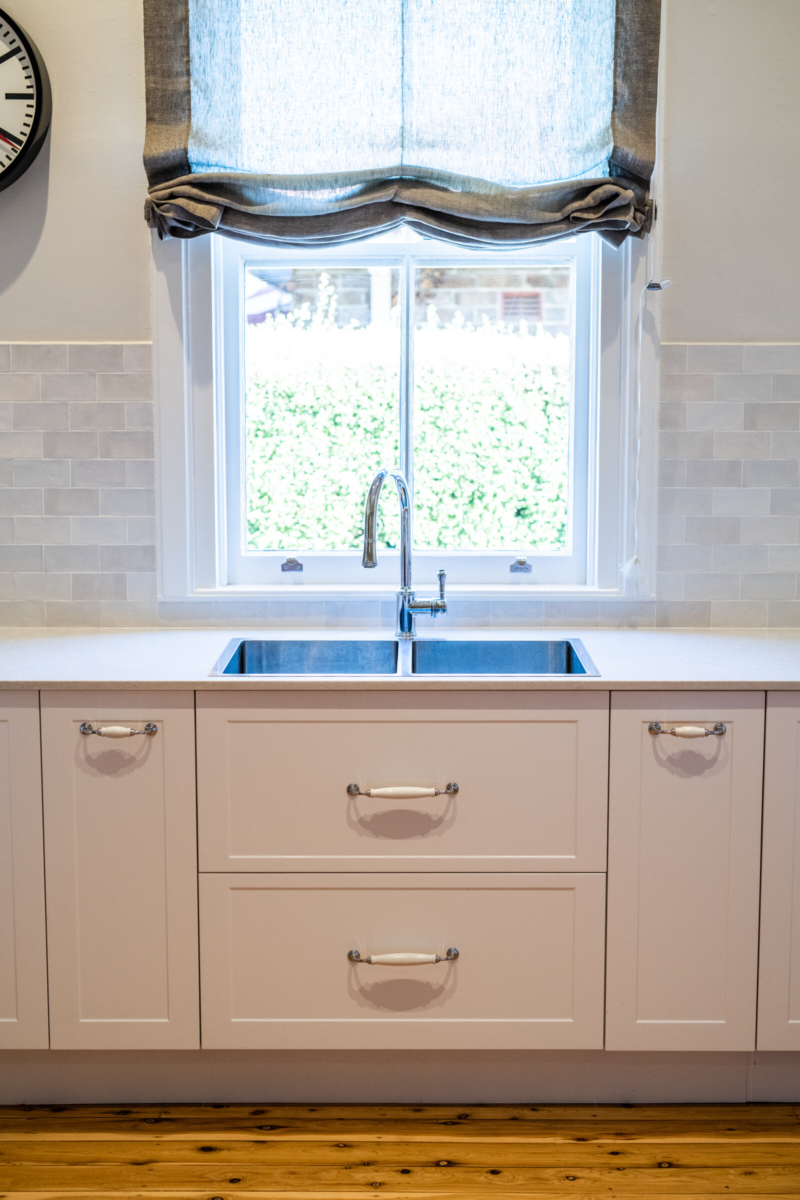
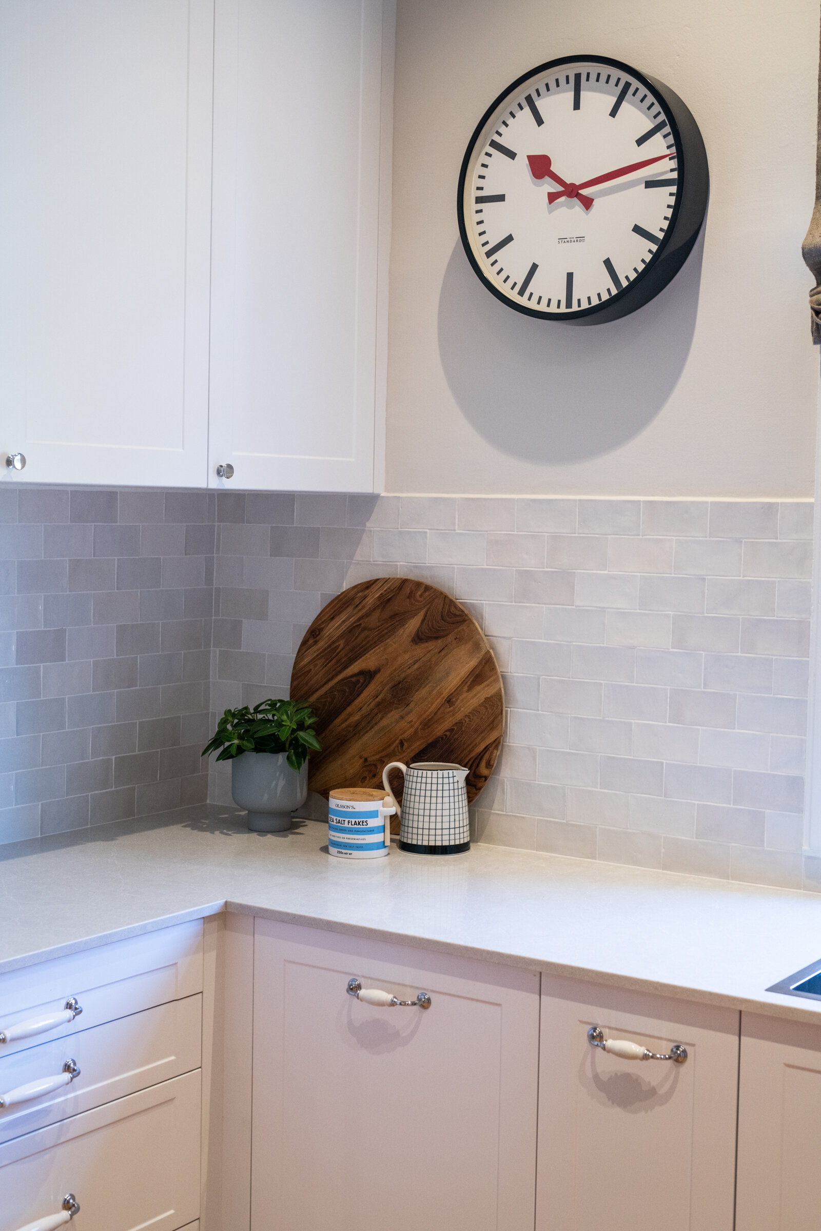
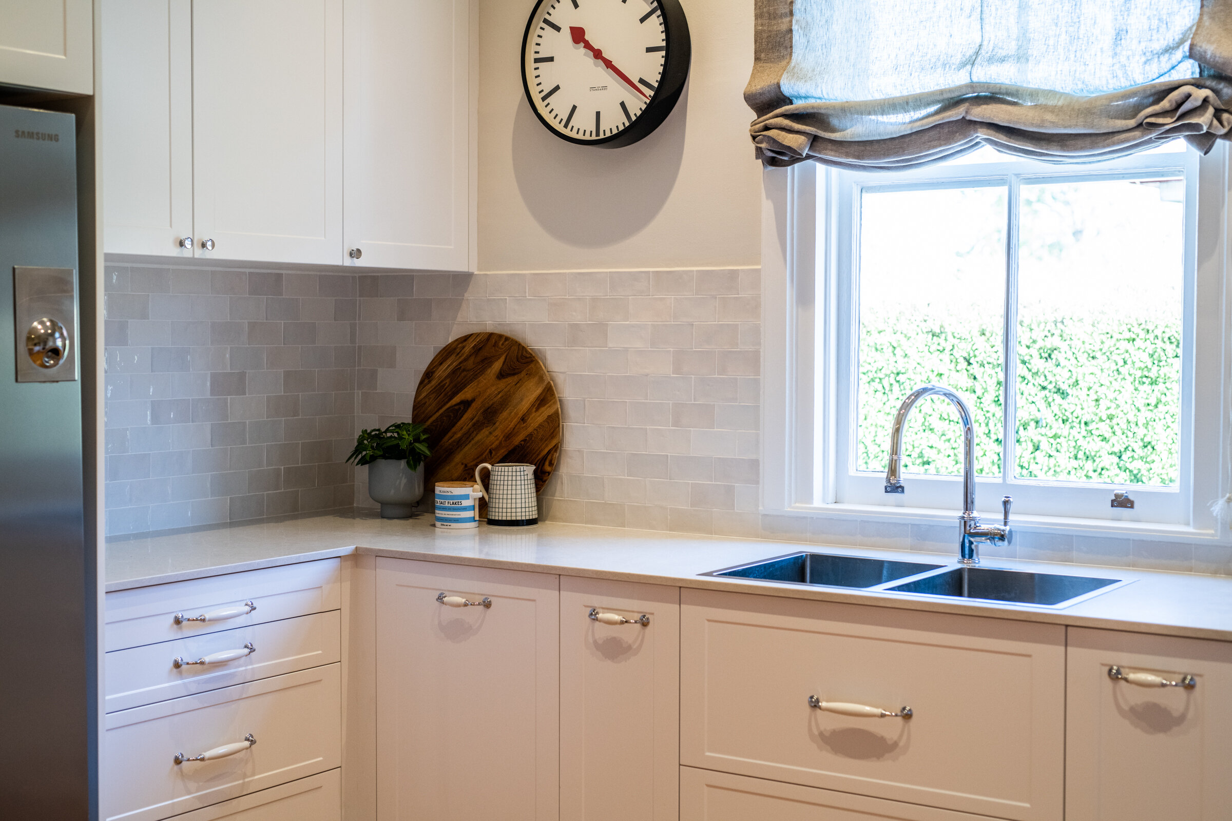
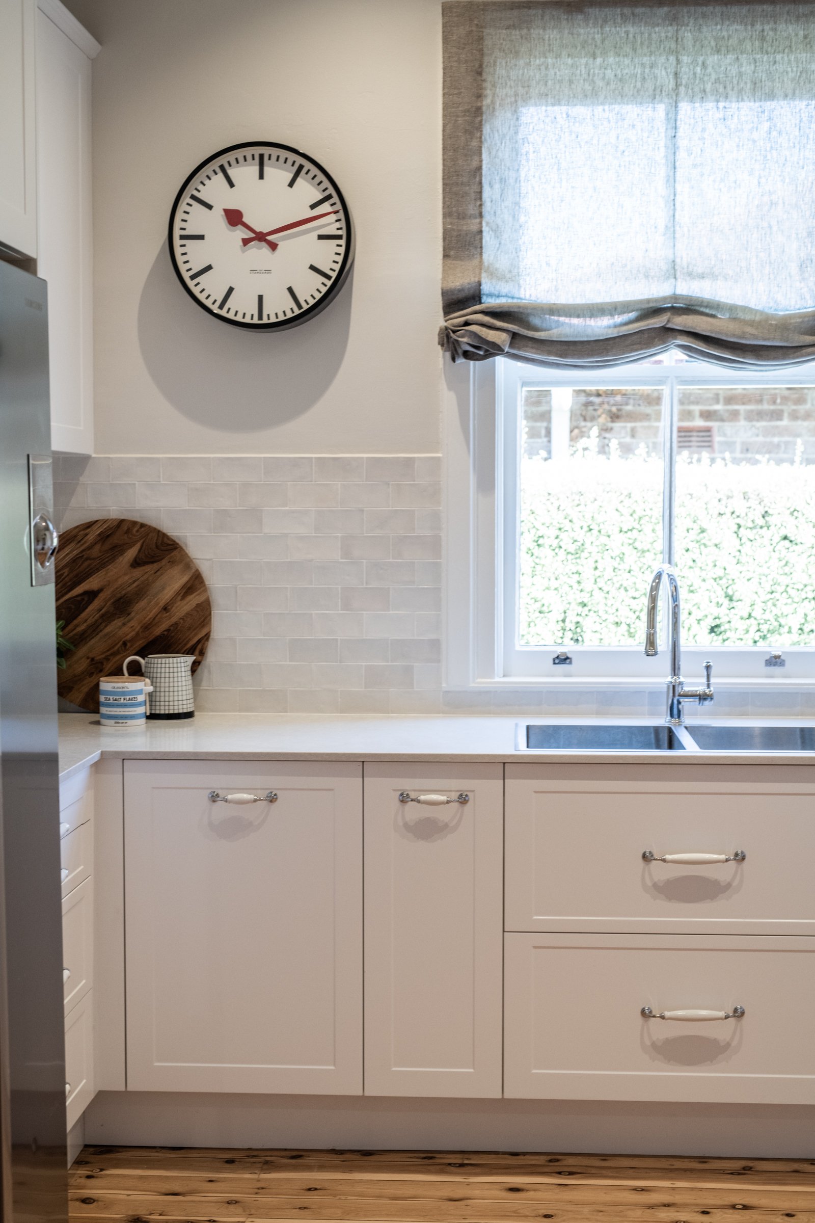
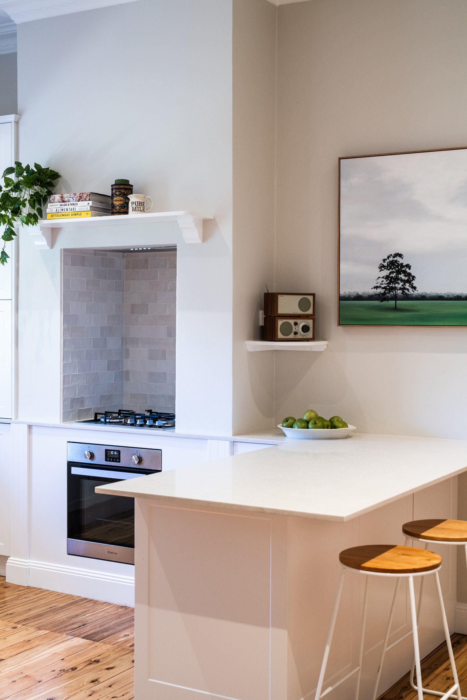
The yellow walls made the space feel dull and crowded - and the lay-out lacked functionality. It was also short on light and storage. We tweaked the lay-out and revitalised the palette to make it light and bright and much more family-friendly, and made the tight space work much harder. We relocated the tap in-front of the window, and aligned the cupboards and drawers to draw the eye outside.
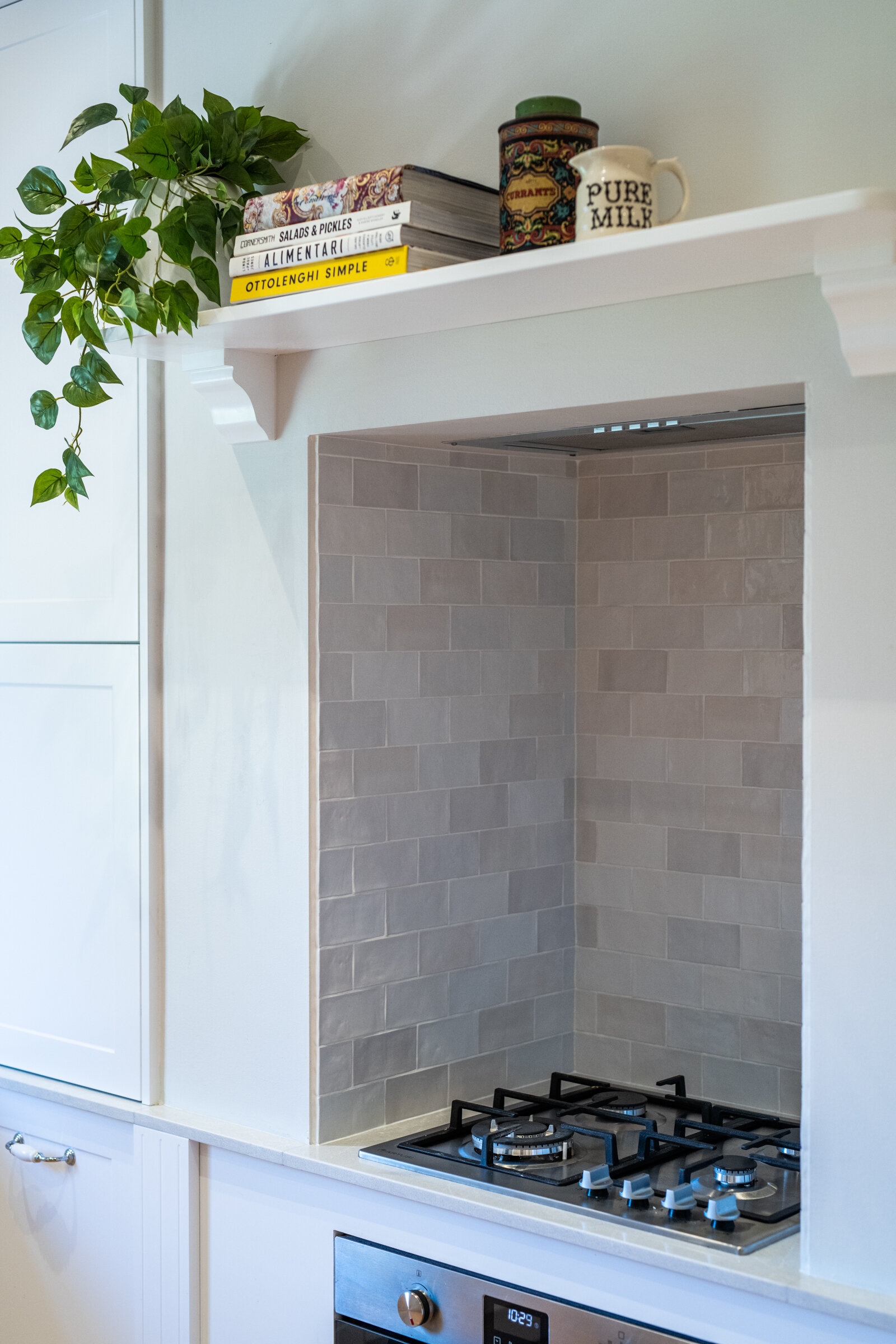
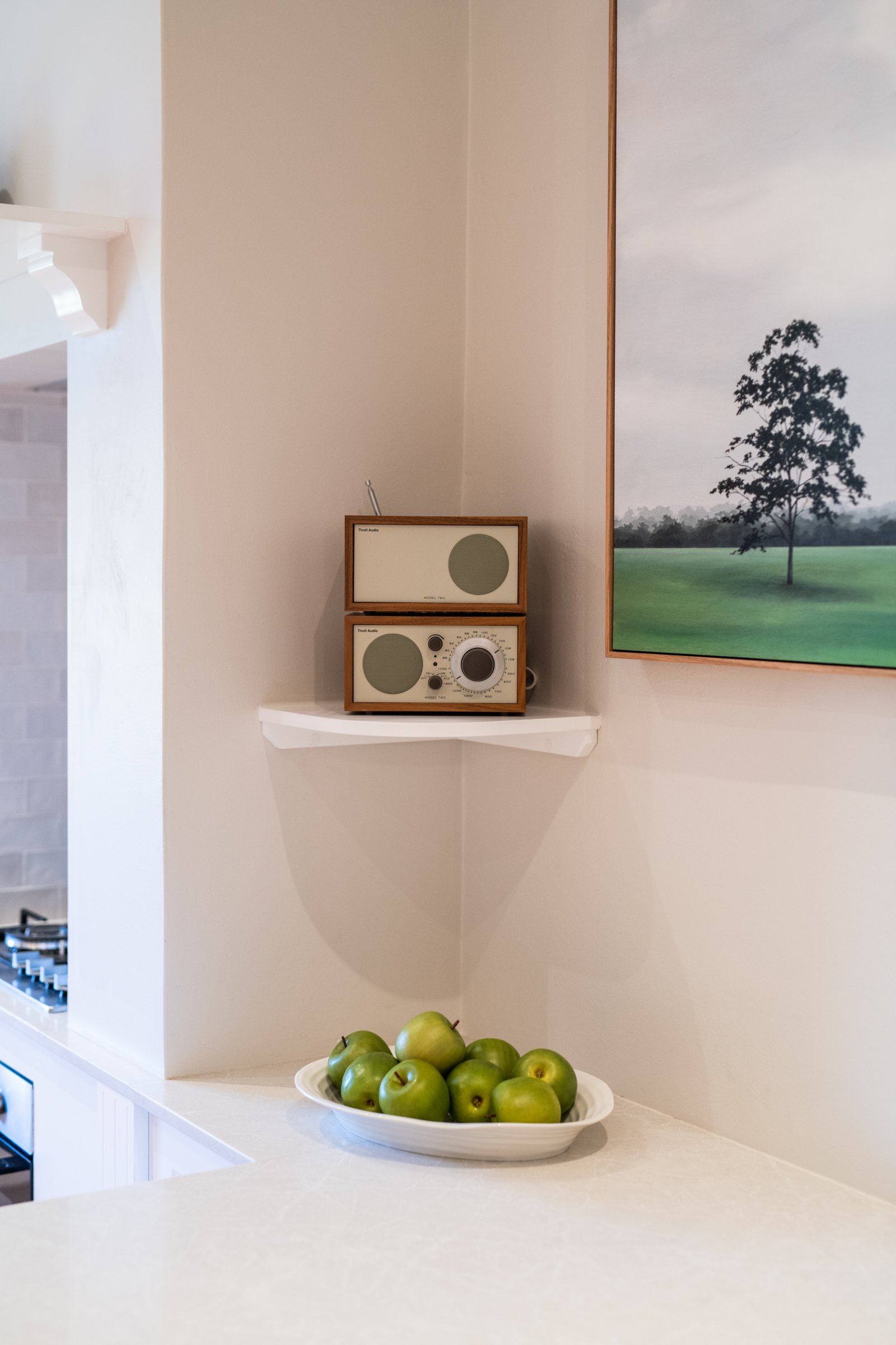
A bench-top cabinet hides away appliances including a kettle, toaster and coffee machine, leaving the bench-tops free of clutter. We were constrained by the existing chimney stack which we widened to accomodate the cook-top. Budget and heritage considerations did not allow us to remove this feature, so instead we embraced it as a focal point of the kitchen.
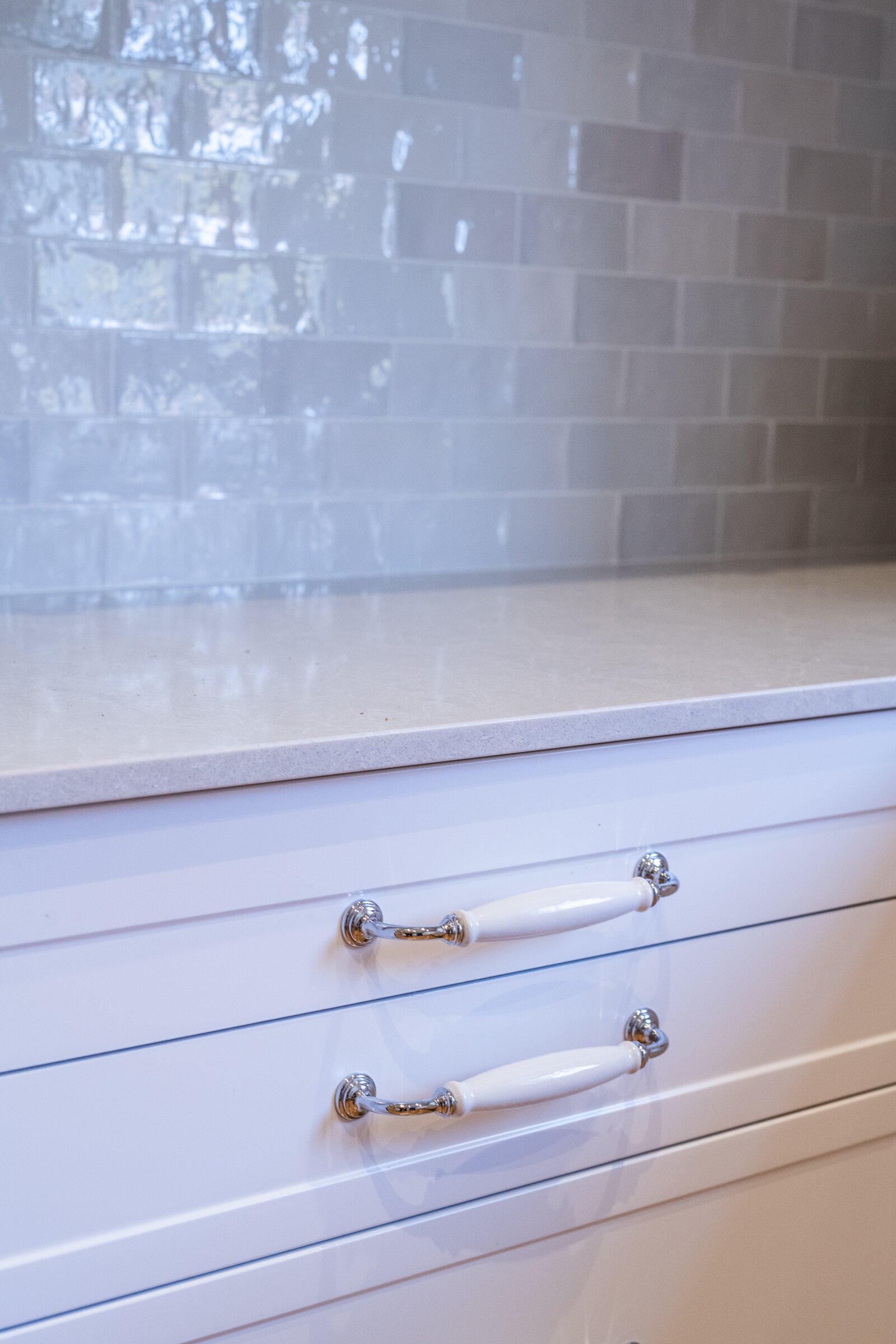
A fresh coat of paint on the walls and re-polished original floorboards finishes off this newly functional, light, bright and airy kitchen, while variegated hand-made tiles add some visual interest to the neutral palette.


